

Using Web Components built with Stencil.js in Angular Project
understanding angularOutputTarget of stencil.config.ts


Intro
Web components are blocks of code that encapsulate the core structure of HTML elements including CSS and JavaScript and enable the code to be used anywhere in websites and web apps, which means independent of framework/library you choose to build your web app.
Traditional frameworks/libraries are not chosen for building web-components because of unnecessary configuration and bloated bundles. It is possible to do with vanilla js but it is too much code and we lose lot of things like reactivity, for example. But that's another different topic though, I don't want war 🌝.
Stenciil.js from the Ionic team is very popular 'not a framework or a library but a compiler like 'svelte' to build web components. Lit-element from google is yet another dedicated framework to build web components. Svelte is also a great choice but still in development(Couple of critical bugs under this item)
But... what are web components?
In layman terms, when you use any library/framework like Vue, Angular, React to build your own components or design system; you might want to use it in another framework as well with the same functionality and design. Just like a 'div' tag that the browser understands. Web Components is a way to build your own HTML tags for e.g '' which has its own characteristics and events that any browser can understand. This makes it independent of the framework and hence chosen to build design systems like buttons, toggles, dropdowns, chips, sliders, what not!
After a lot of research, I choose stencil.js for building web components because of its simplicity and template extraction in TSX (JSX in typescript) format, first-class Typescript support, Shadow DOM, and most importantly its distribution mechanism, and built-in wrapper support for Angular, React, and Vue.
Waittt...what? what does the last part mean?
Say for e.g you want to use Angular's code syntax for two-way data binding using [(ngModel)] when you use this in Angular project? Stencil with little config generates a wrapper on top of web components with some proxy magic and you can just treat that component like any regular angular component
Stencil makes distribution so easy, you can make an npm package out of it, lazy loading web components (love this ❤️), or individually share each component with its js file very easily.
on top of this, as you write the code for components, stencil keeps a readme.md for your component with its documentation!
Oh man!! Too much jargon!

Let's dive into this practically
First, generate a regular stencil project with its own stencil-cli
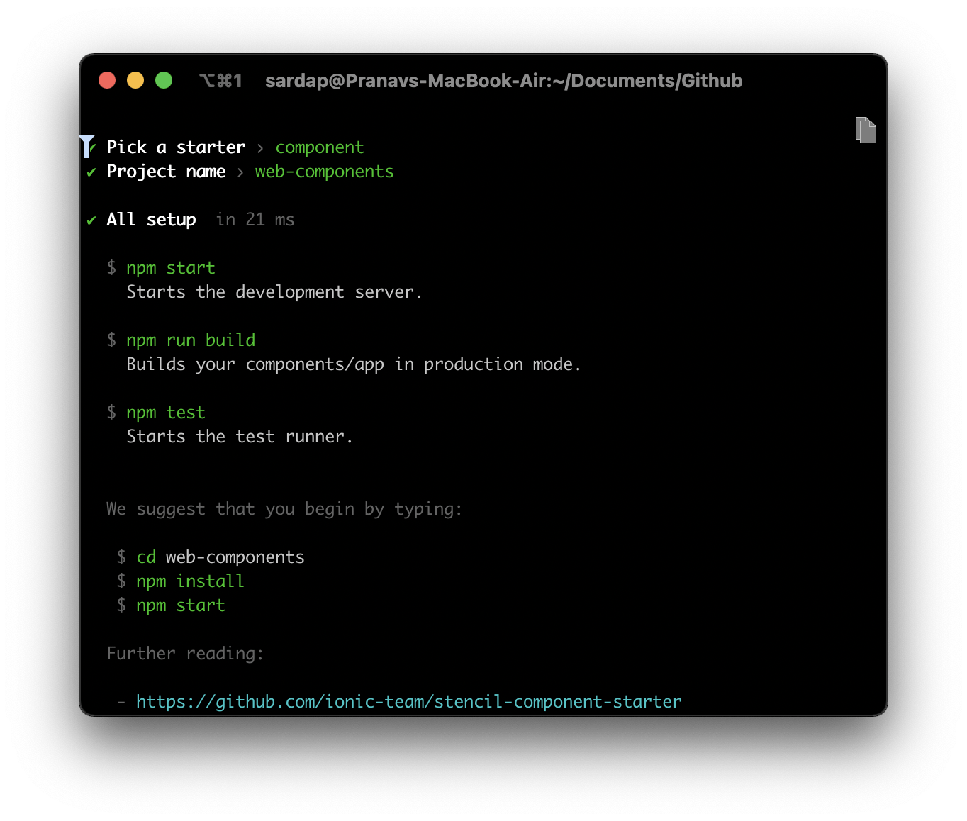
run this command to initialize stencil
npm init stencil
select component from the option since we want to build web-components
? Pick a starter › - Use arrow-keys. Return to submit.

❯  component     Collection of web components that can be used anywhere
   app           Minimal starter for building a Stencil app or website
and give a project name, for e.g. web-components and you would see something like this
all right, let's setup
cd web-components && code .
once you scaffold the structure, it's pretty straightforward to understand what goes where!
we get a components folder where we can generate another stencil component using npm run generate another-component command but we will stick to pre-ready component for this demo.
To remove those red error squiggles from vscode. let's install dependencies first
npm i
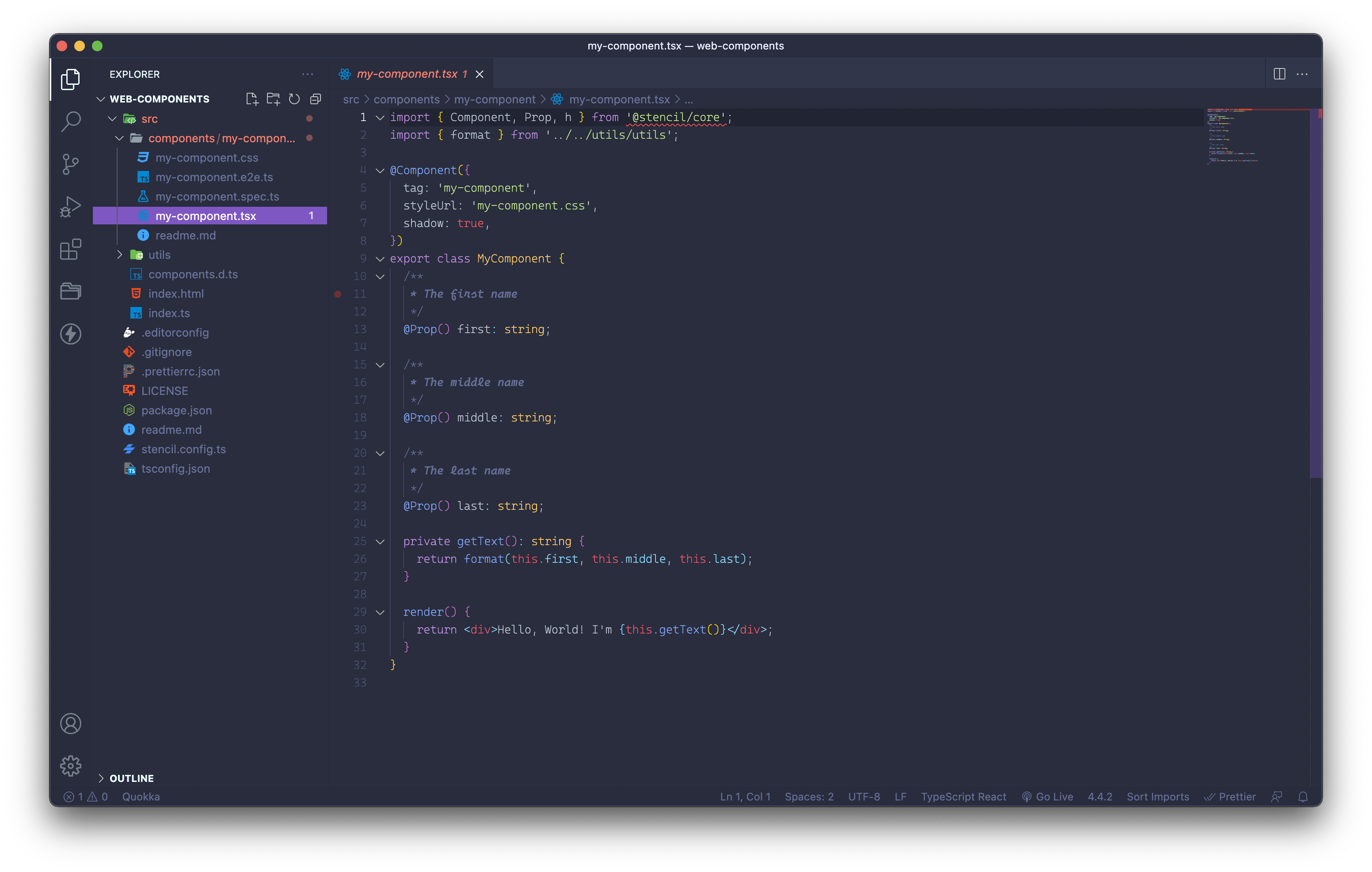
inside the components folder, there are 5 files
my-component.css- styling for your component, you have an option to keep this encapsulated. which means CSS written inside this won't leak outside the component.my-component.e2e.ts- E2E testing file for the componentmy-component.spec.ts- Jest Test file for writing unit test casesmy-component.tsx- Component Template and Logicreadme.md- Component Props, Functions Documentation based on JSDoc comments 😍
utils folder can be used to create reusable utility functions, decorators, API config, etc.
and if you noticed there is one important config file called stencil.config.ts
import { Config } from '@stencil/core';

export const config: Config = {
  namespace: 'web-components',
  outputTargets: [
    {
      type: 'dist',
      esmLoaderPath: '../loader',
    },
    {
      type: 'dist-custom-elements',
    },
    {
      type: 'docs-readme',
    },
    {
      type: 'www',
      serviceWorker: null, // disable service workers
    },
  ],
};
I will not dive deep into this. You can read more about this [here (stenciljs.com/docs/distribution#distributio..)
we will be using dist-custom-elements build as it is the one that lazy-loads components and all we need to do is point to one index.js file. As the official documentation says
The dist-custom-elements output target is used to generate custom elements in a more optimized way for tree shaking, and its the recommended approach when using any frontend framework integrations. For example, if a component library has 100 components, but an external project only imported one component from the directory, then only the code used by that one component would be pulled into the project. This is due to Stencil's use of ES Modules and the compiler generating friendly code for bundlers to parse and understand.
now if you run build command
npm run build

> web-components@0.0.1 build /Users/sardap/Documents/Github/web-components
> stencil build --docs

[27:07.0]  @stencil/core
[27:07.1]  v2.12.1 🍔
[27:09.6]  build, web-components, prod mode, started ...
[27:09.6]  transpile started ...
[27:13.1]  transpile finished in 3.52 s
[27:13.1]  copy started ...
[27:13.1]  generate custom elements started ...
[27:13.1]  generate lazy started ...
[27:13.3]  copy finished (0 files) in 217 ms
[27:13.8]  generate custom elements finished in 668 ms
[27:14.1]  generate lazy finished in 1.04 s
[27:14.2]  build finished in 4.60 s
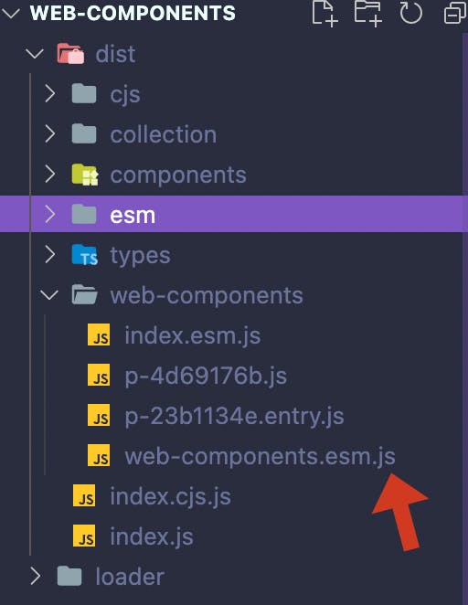
this is how dist folder is created and all we need to point is this .js file. Other .js files with p- are lazy-loaded components.
now if you open index.html in this project to test it out (or your own html in other project, with live server) and add one script tag to include this .js and use our component tag my-component.
For sake of demo I am using index.html in same project hence using relative paths
<!DOCTYPE html>
<html dir="ltr" lang="en">
  <head>
    <meta charset="utf-8" />
    <meta name="viewport" content="width=device-width, initial-scale=1.0, minimum-scale=1.0, maximum-scale=5.0" />
    <title>Stencil Component Starter</title>

    <!-- include .js entry file here with type="module" -->
    <script type="module" src="../dist/web-components/web-components.esm.js"></script>
  </head>
  <body>
    <my-component first="Stencil" last="'Don't call me a framework' JS"></my-component>
  </body>
</html>
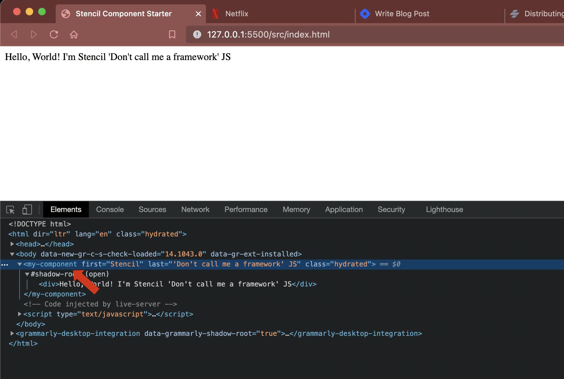
run the server if you have go-live extension in your vscode you can open HTML and click on go-live at bottom. It would host index.html on HTTP server and opens up browser.

Tada!
you see this in the browser! This is actually a web component that can be used in any web project.
Let's take this further and see how to integrate with Angular Project.
Now there are two ways you can use it.
- Treating it as a normal web component and include .js file and use it.
- generate stencil provided angular-wrapper on top of this which we can use with Angular benefits
from official docs
The goal of a wrapper is to smooth over how Stencil’s code works within a framework. Wrappers provide a function that you can use within Stencil’s Output Targets to automatically create components for the targeted framework that wrap the web components you author in a Stencil project. One benefit of the wrapper pattern includes improved maintainability since you are writing code once, and reusing it across frameworks. Another benefit of this pattern is that you can have first-class integration with your framework of choice. For example, with the Angular wrapper, you can bind input events directly to a value accessor for seamless integration in Angular’s bi-directional data flow.
Note: Now the official doc for integration with Angular is with Angular Library and not a project which is why I am writing this article for the steps I struggled to directly integrate in Angular Project (not via library).
Jump back to stencil.config.ts
to use Angular Output Target we need to do
npm i @stencil/angular-output-target
npm i @stencil/sass
we will now modify stencil.config.ts file and add angularOutputTarget and few more options
// new imports here
import { angularOutputTarget, ValueAccessorConfig } from '@stencil/angular-output-target';
import { sass } from '@stencil/sass';
import { Config } from '@stencil/core';

// props binding
const angularValueAccessorBindings: ValueAccessorConfig[] = [];

export const config: Config = {
  namespace: 'web-components',
  outputTargets: [
    {
      type: 'dist',
      esmLoaderPath: '../loader',
    },
    {
      type: 'dist-custom-elements',
    },
    {
      type: 'docs-readme',
    },
    {
      type: 'www',
      serviceWorker: null, // disable service workers
    },
    angularOutputTarget({
      componentCorePackage: '', // let's comeback here later
      directivesProxyFile: '', // let's comeback here later
      valueAccessorConfigs: angularValueAccessorBindings,
    }),
  ],
  plugins: [sass()],
};
NOTE:
Two options in angularOutputTarget are purposely kept empty so that we understand what we are doing here.
Let's generate a sample angular project using angular/cli
If you don't have angular installed run this somewhere outside our web-components folder
npm i -g @angular/cli
then generate a project using
ng new stencil-angularapp-demo && npm i
➜  Github ng new stencil-angularapp-demo
? Would you like to add Angular routing? Yes
? Which stylesheet format would you like to use? SCSS   [ https://sass-lang.com/documentatio
n/syntax#scss                ]
CREATE stencil-angularapp-demo/README.md (1067 bytes)
CREATE stencil-angularapp-demo/.editorconfig (274 bytes)
CREATE stencil-angularapp-demo/.gitignore (604 bytes)
...
now move this web-components and stencil-angularapp-demo inside a common folder le'ts say 'my-project' and open that in VSCode
Open tsconfig.json
This is where we will use the typescript path feature for keeping the stencil project as its dependency.
Add src/libs/generated folder and include relative path to dist directory of web-components in tsconfig.json inside paths like below
 "paths": {
      "@web-components/*": ["../web-components/*"]
   }
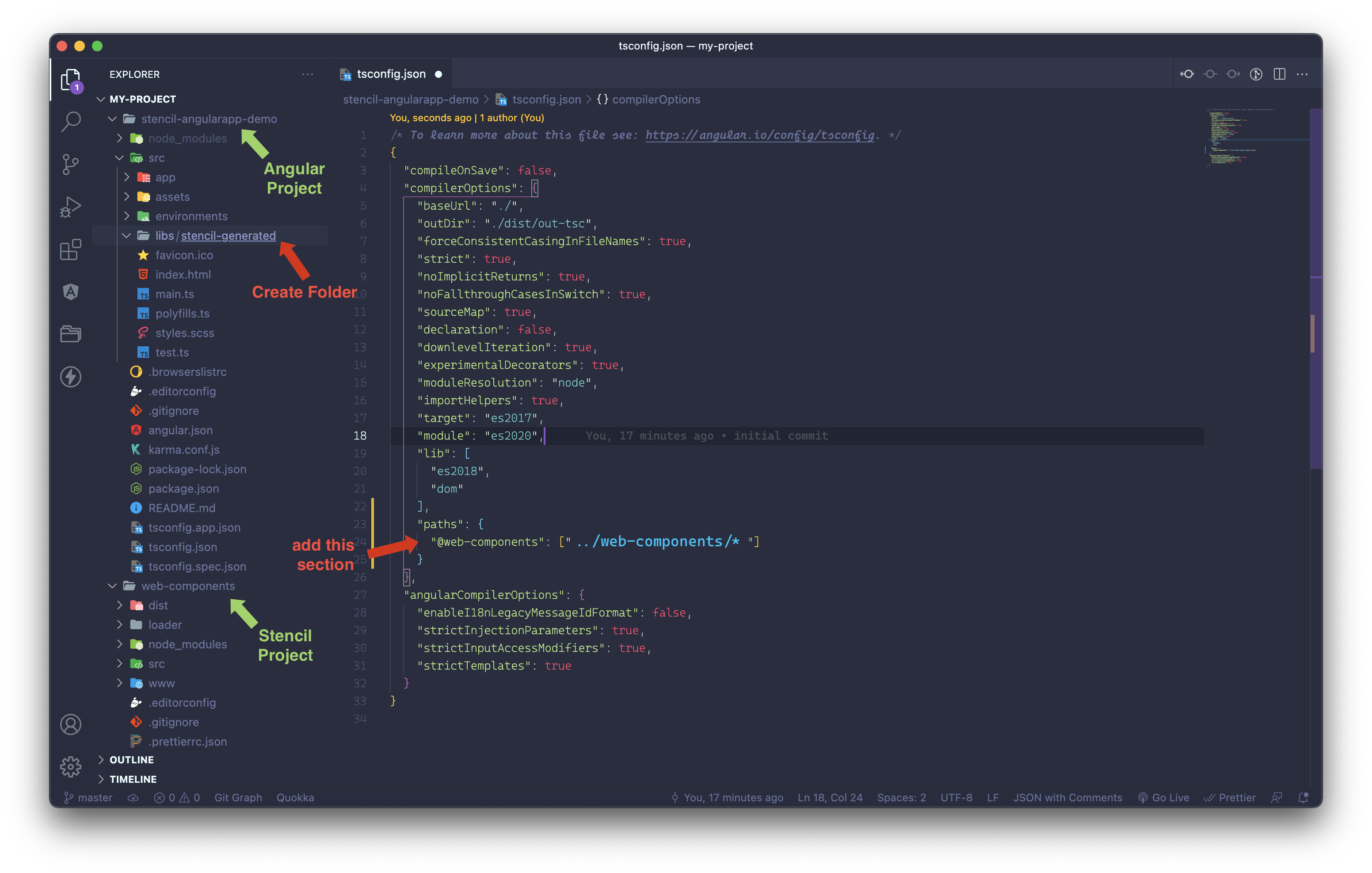
Now add an angular module from we will export our components inside this libs directory like below
Our basic angular configuration is done!!
Let's head back to stencil.config.ts
Now inside angularOutputTarget we had left two keys blank, fill them as below. Note the relative paths are very important here.
Remember we set our custom path for @web-components as "../web-components/* in tsconfig.json? We will use that heavily further.
   angularOutputTarget({
      componentCorePackage: '@web-components/dist/components',
      directivesProxyFile: './../stencil-angularapp-demo/src/libs/stencil-generated/proxies.ts',
      valueAccessorConfigs: angularValueAccessorBindings,
   })
and run build command inside web-components
npm run build
After this, you would see out the stencil-generated folder is populated with some files.
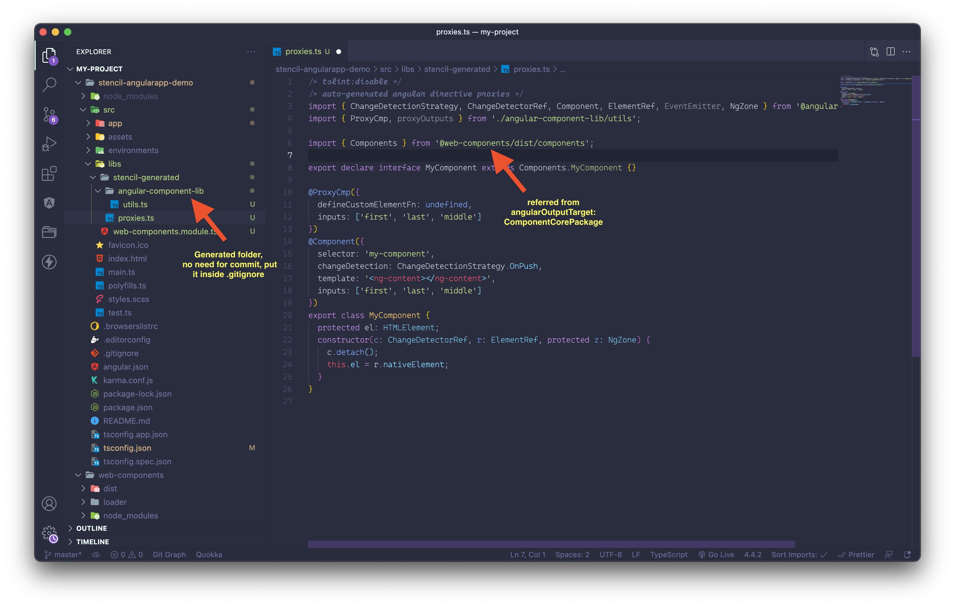
If you notice because of our tsconflg.json settings, angular is able to know what @web-components/dist/components is referring to. @ProxyCmp is stencil's own decorator and wraps custom component with the same tag name allowing us to use it without any modifications 🤩
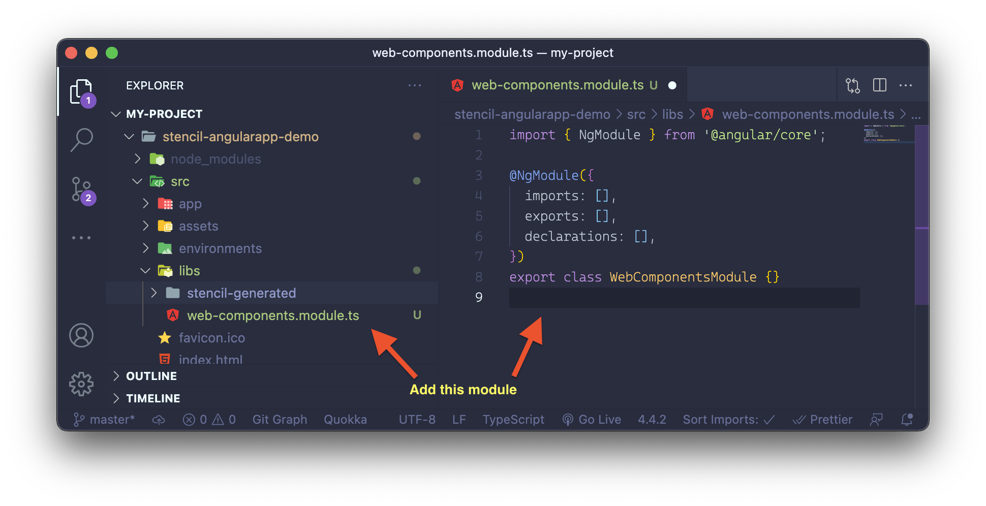
One last thing we have to do is export this generated component module called web-components.module.ts
Add our component definition in the declarations and exports block.
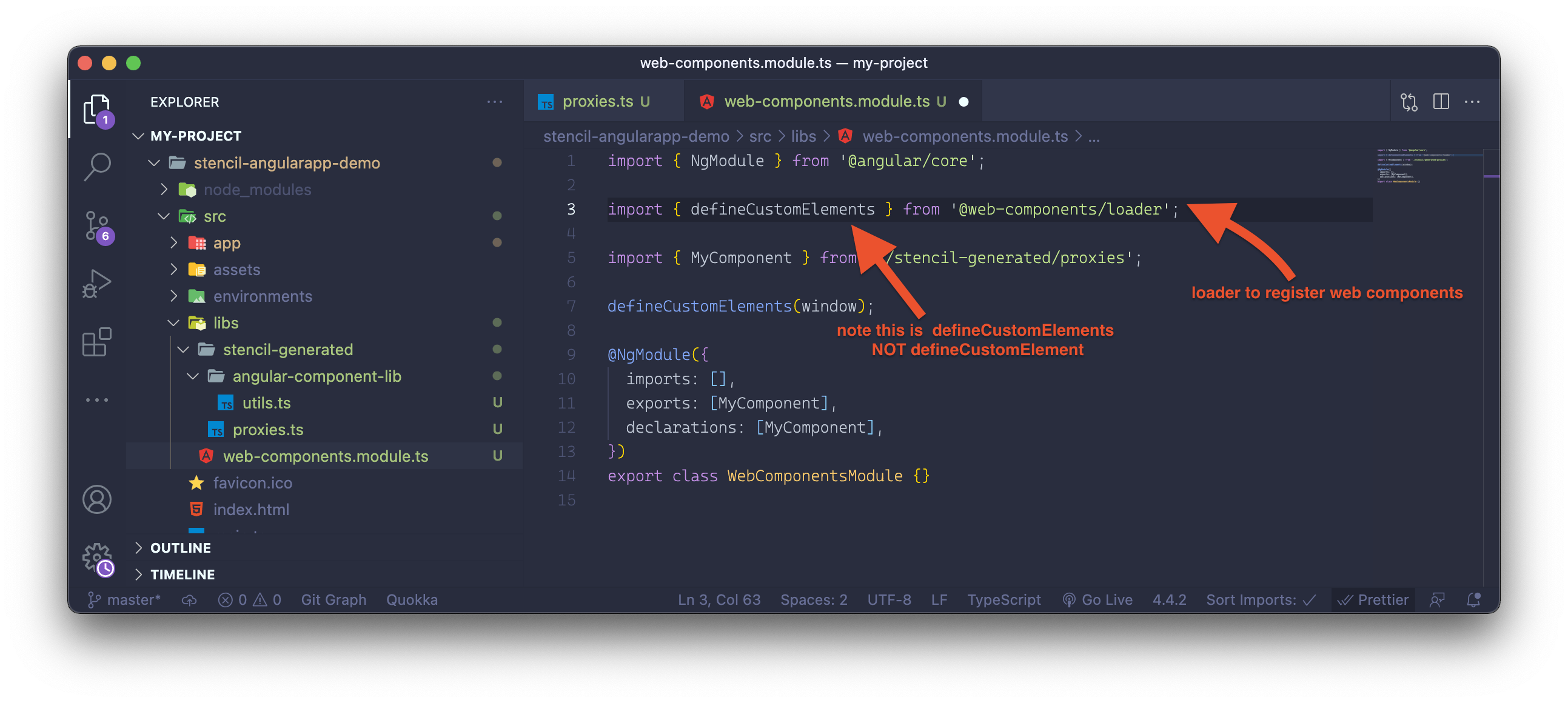
NOTE: Many folks miss here that since these are custom elements, we need to use the loader to define these. This line is very important without which the browser would render nothing.
Alrighty 😍! we have our setup ready, let's consume
I will import WebComponentsModule inside any Angular Module to use my-component. Let's take app.module.ts for this example and edit app.component.html for this example.
app.module.ts
import { WebComponentsModule } from 'src/libs/web-components.module';

import { NgModule } from '@angular/core';
import { BrowserModule } from '@angular/platform-browser';

import { AppRoutingModule } from './app-routing.module';
import { AppComponent } from './app.component';

@NgModule({
  declarations: [AppComponent],
  imports: [BrowserModule, AppRoutingModule, WebComponentsModule],
  providers: [],
  bootstrap: [AppComponent],
})
export class AppModule {}
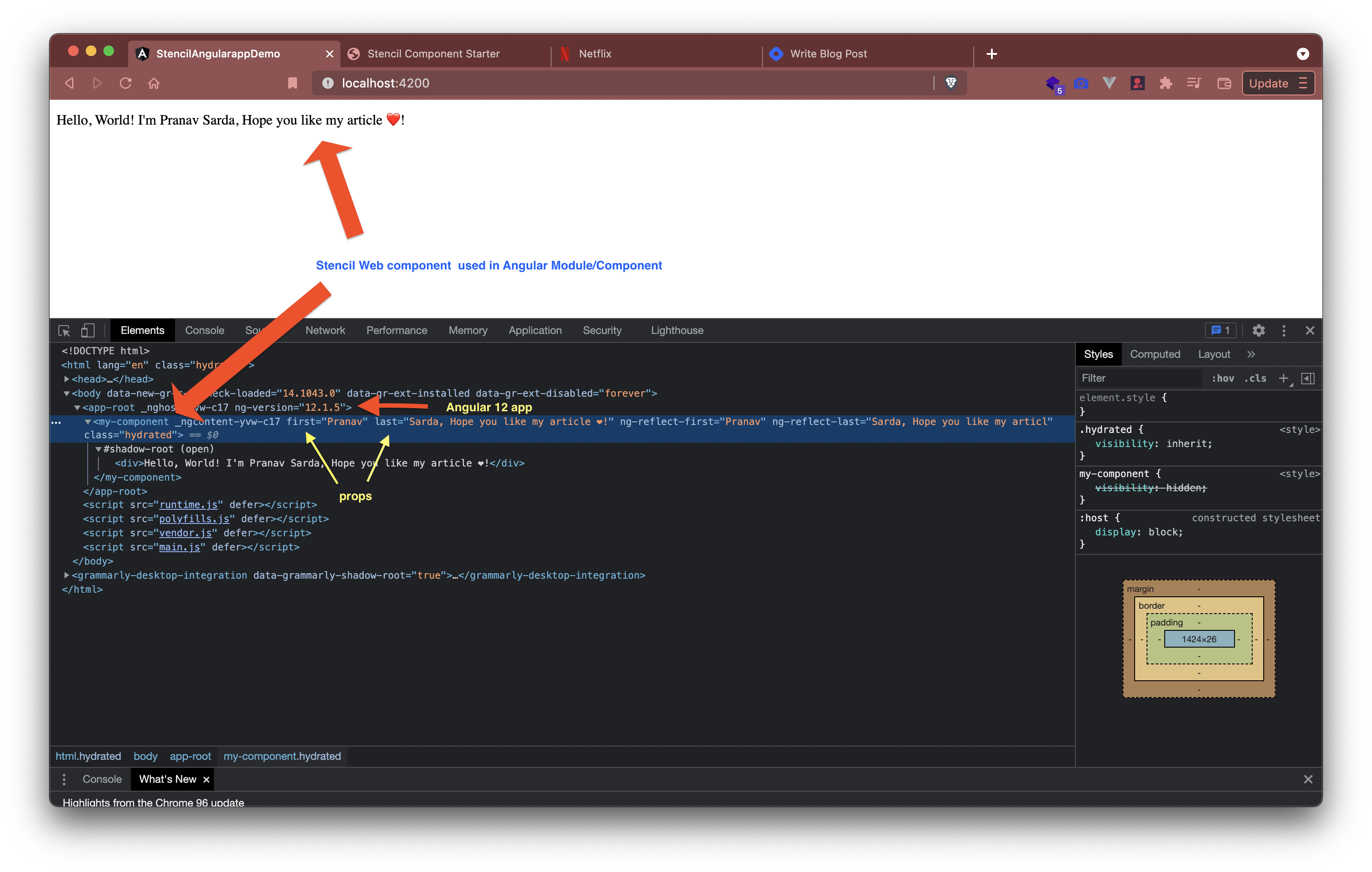
app.component.html
<my-component
  first="Pranav"
  last="Sarda, Hope you like my article ❤️!"
></my-component>
run the angular app in dev mode
ng serve
Voila! Magic 🪄
Open localhost:4200 in browser and ...
Bonus Tip 🍰
Now if you start both web-components and angular project in dev mode, you would see changes in web components real time in angular app 😨!! Ain't that crazy for developer.
Run inside web-components (stencil.js project)
npm run start
Run inside the angular project
ng serve
Open http://localhost:4200 change web component code, see the change on 4200 😎!
Note: Take care that before angular build happens, stencil project build should happen. For this complicated setup, it is recommended to use mono repo setup. there comes nx.dev to rescue, all of the things we did above can be done in 5 mins with stencil's nx extension called @nxext/stencil & @nx cli. This article was just to demonstrate how different pieces connect together.
Repo with this setup is available here 📦
Happy Coding. If you like this article, like & share it with your friends. 🥰 Follow me for more such interesting topics.